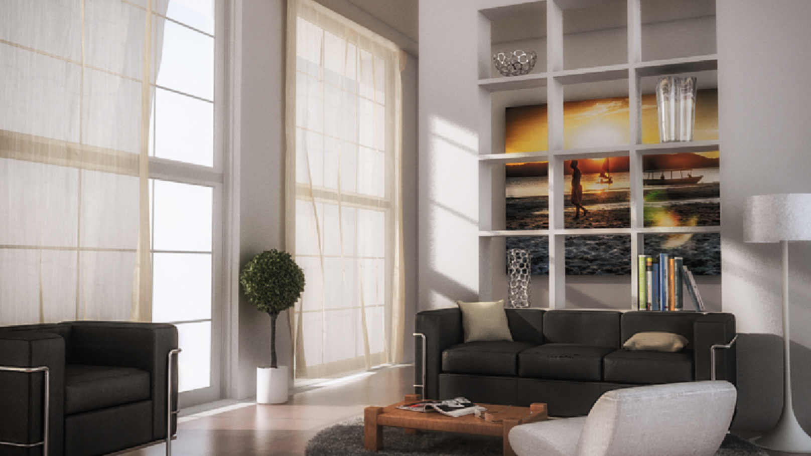
Graphic Design
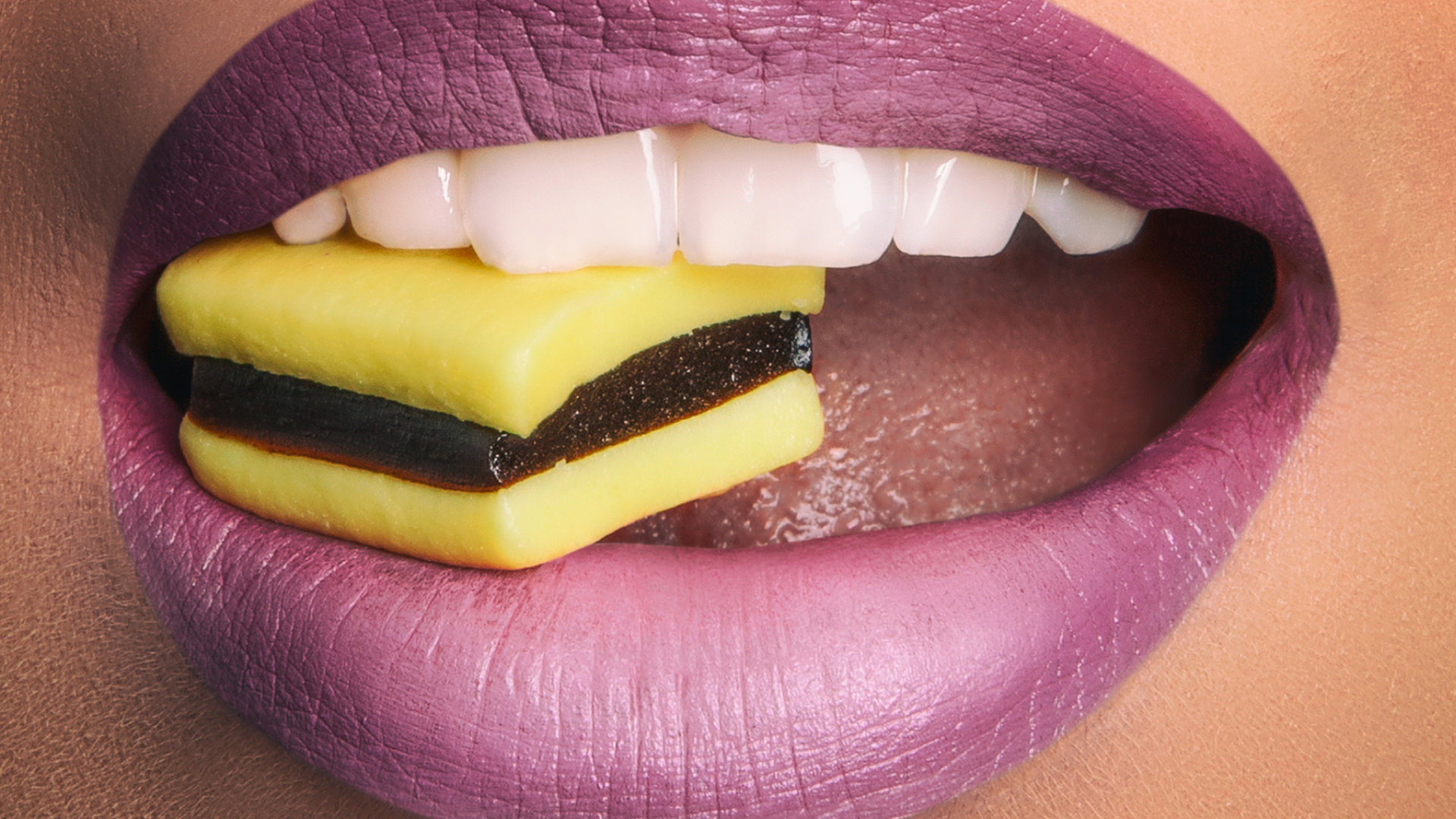
Image Retouching
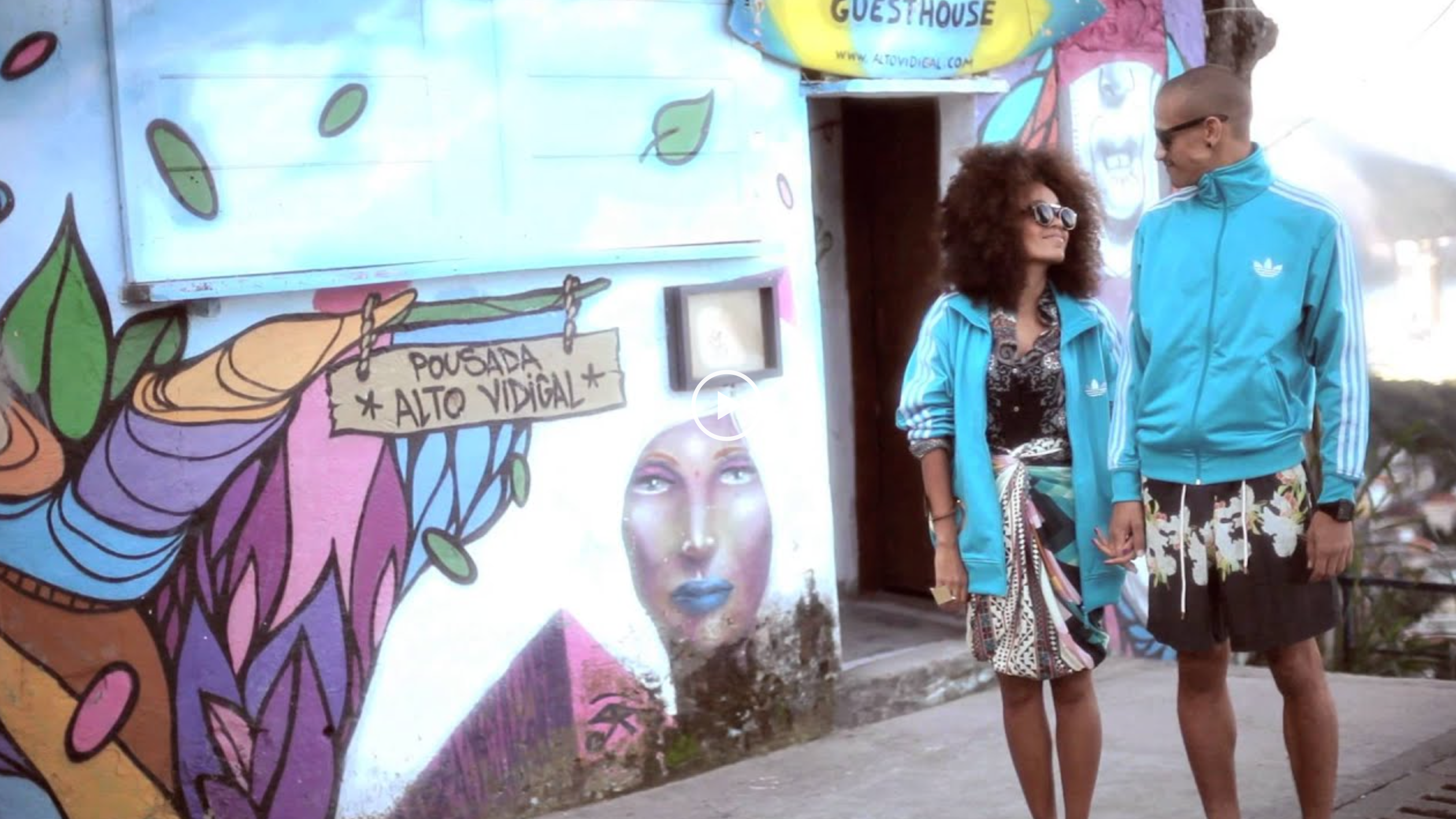
Video Editing and Motion
Flyers
About Me
Contact
Graphic Design
Image Retouching
Video Editing and Motion
Flyers
About Me
Contact
FABIO ABU
PHOTOGRAPHY
2020
VIDEO
2020
X-PRO
2020
↑
Back to Top