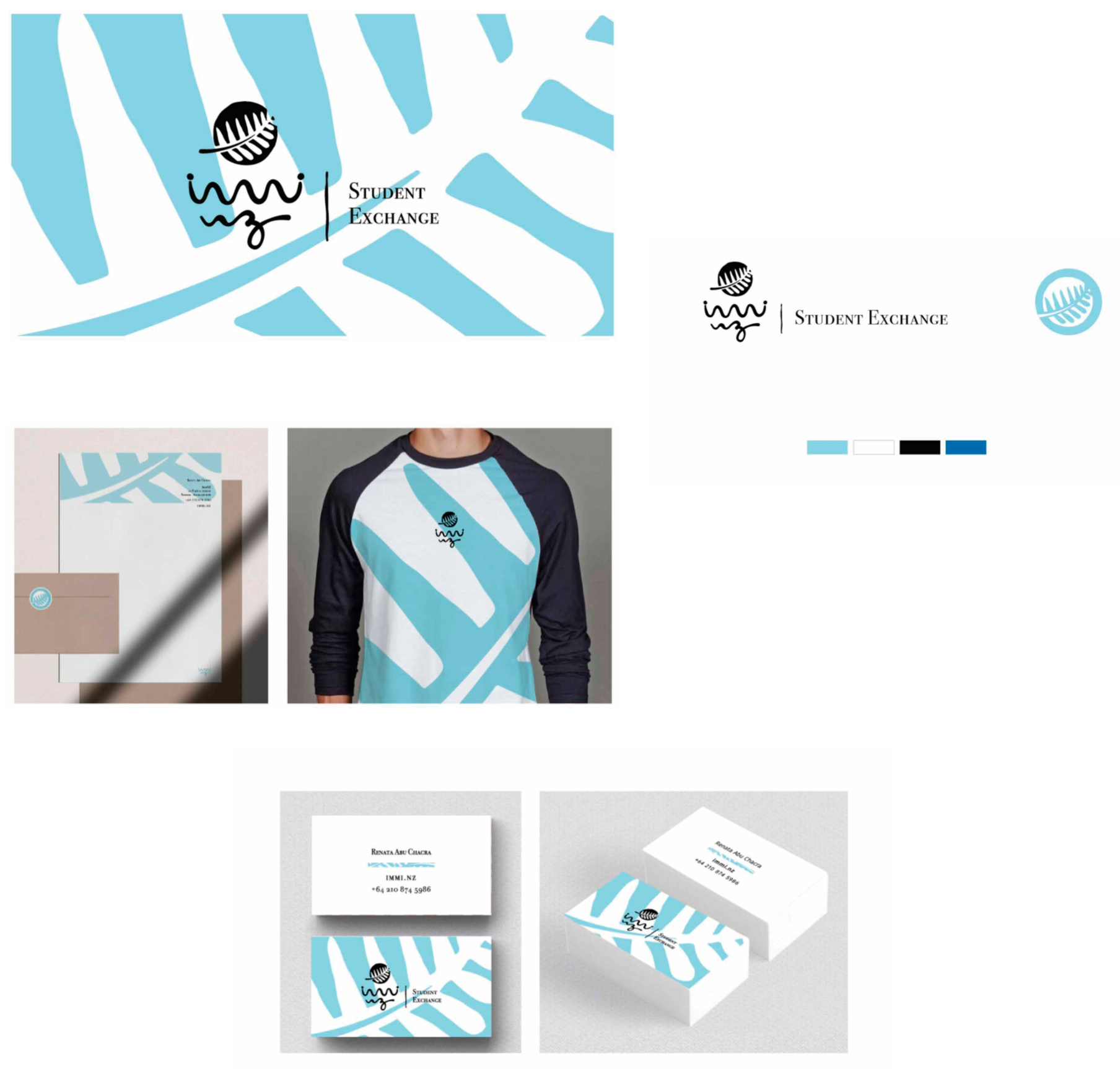
Art Direction
This is a student exchange company looking to build an emotional connection with its clients. They usually deal with parents, who look for a company that provides a well-structured support system for their children. We decided to use an organic design of lines and blue colors to represent tranquility.